WAVE Accessibility Report

I did not know what to expect at all for my WAVE report, I didn’t even know that there were accessibility issues for websites much less a testing software, but what an eye-opener! WAVE pointed out that my biggest issue was contrast errors, so I would need to make sure that my future blogs would have a lot more contrast by making the text darker to ensure enough contrast between the text colour and the background. Another really big problem was concerning structures. WAVE pointed out that there were a lot of confusing headings in my post, with little hierarchy. In my future blog posts, I will be sure to add more sub-headings and headings to provide better navigation for readers. There were also a lot of dead links, which I expected since most links of the blog have not been populated yet.
Inclusive Design
In my opinion, inclusive design consists of a design perspective resulting in a website that is usable and accessible to as many people as possible, regardless of their abilities, disabilities, or other characteristics. This includes alternative text for images, proper structure, color contrast, keyboard accessibility, transcripts and more. Media and multimedia play a powerful role in UDL, including offering content in various formats, such as text, images, audio, and video, which allows all kinds of people to be able to learn and understand content. Multimedia can also be tailored to suit individual learners’ preferences and needs. For instance, students can opt to watch a video, read a transcript, or listen to an audio version of the same content. Ultimately, I think that media and multimedia may represent the next generation of learning, as previous generations that relied on books or computers severely restricted the people who can access information. Media and multimedia significantly open more doors for everyone to be able to learn.
The World’s Worst Powerpoint Presentations
Referring to The World’s Worst PowerPoint Presentations, all the presentations were horribly contrasted, with jumbled words everywhere and quite hard to follow even for me, someone who has basically no visual impairments. A couple of them were awfully designed with letters that were too small, figures that had too many things going on, invisible text and ads. Really? Who puts ads on presentations? I hope they got compensated horribly. They lacked just about every design principle there is. The information could not be perceived clearly by most people making it difficult to understand as well. Simplicity was also severely misunderstood. The color schemes were not good as well, with some invisible text and awful choices, resulting in hard-to-read text. Most of them lacked whitespace and alignment, resulting in some ugly and messy slides.
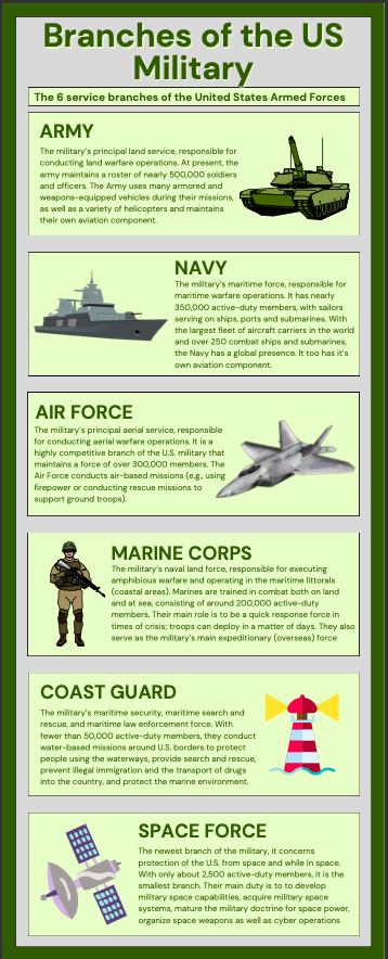
Design Principles used for my Infographic
Which design principles did you use to create your infographic in Canva? Which elements of a ‘good infographic’ were you able to incorporate? What other principles did you consider? What does the template make easier and what does it make harder when creating your infographic?
When creating my own infographic, I tried to do exactly the opposite of all the presentations featured in The World’s Worst PowerPoint Presentations. For starters, I focused on creating a hierarchy design to help better focus my design. I also tried to use contrast in colours to draw attention to the important points/parts within my infographic. I did this by using bright and contrasting text boxes for each level of Maslow’s hierarchy of needs, that also colour coordinated to the sample image of the hierarchy at the top of the infographic. Each colour-coordinated segment was dedicated to each need, signalling the important information within the infographic. Overall, my main goal was to create an infographic that clearly and directly displayed valuable information and did not overwhelm readers like how I felt when I was looking at the world’s worst PowerPoint presentations. Through a simple, yet effective presentation, I want readers to have an easy time learning from my infographic that abstained from overloading their working memory.
When designing my infographic, I tried to adhere to a simple but effective color scheme, with dark green letters and an almost pale background, ensuring that the text stood out but also had something to do with the theme. I also tried to keep a hierarchical design, with headings and sub headings in bigger and bold letters while information was kept to a normal font. The images I used were chosen because they were simple and communicated the message well. I did not want readers to feel as confused as I was when reading The World’s Worst PowerPoint Presentations, and negative space played a part in that as the graphics were implemened in a way that was not too overwhelming. I also focused on alignment a lot, making sure that the text and graphics were all aligned in a grid-like fashion. My infographic can be seen below
2023-10-14 at 11:05 am
Another awesome post, Ryan! I find reading your blog posts highly beneficial to furthering my knowledge on course content because of your clear and meaningful explanation of things! I think we can both agree that this weeks module definitely made us reconsider our blog posts and how we can create them to be more accessible. This is something that had never really crossed my mind before! Your infographic is great too! Your use of alignment of text and visuals was well done, making it easy to follow along. I also enjoyed how you stuck with the same theme as your lesson from last weeks blog. I am sensing someone has a keen interest in the military…
2023-10-14 at 8:34 pm
Hello Ryan! I like how you used The World’s Worst Powerpoint Presentations to help you create your infographic. While using looking at good quality examples can be a great way of learning something new, I think learning what not to do can be quite helpful as well.
I like your thoughts on how relatively new technology can help us make more inclusive websites! While I think it is easy to be a little afraid of the consequences of new technology, I believe it is important to recognize the god that can come from it.
I quite like the amount of contrast that you used in your infographic. I sense that you translated your learnings from examining your WAVE report and The World’s Worst Powerpoint Presentations to your infographic! Is there a reason why you ordered the six branches of the US military the way that you did?
2023-10-28 at 10:17 am
thanks for the feedback! it was in order of importance and size!
2023-10-14 at 9:20 pm
Hello Ryan,
Your focus on accessibility and clarity in your design principles is commendable. It’s great to see you applying the lessons from “The World’s Worst PowerPoint Presentations” to create an infographic that’s simple, well-structured, and easy to understand. Keep up the excellent work!